A new artwork! I know it's been a while, and yes, I'm not dead. Lots of moving parts in my life these few months have prevented me from actively drawing much (for example, I've moved back from Montreal to Paris!), but it's gotten better and I'm back at it. There have been some new stuff uploaded on the comics site though, so go check it out if you want to see more of my universe or are just finding it out !
I've been wanting to draw a Christmas illustration basically since I've had the blog but it never seemed to work out quite as I wanted to. This is my fourth version of Santa (after this one, this horrible one and this sexy one). I'm pretty happy with this one though, with its little Art nouveau flair. The inclusion of my red-bearded Prince comes from a Christmas-themed short story idea that would involve him and other fairy-tale characters, but I mostly just wanted to draw him again as it had been a while (check out his latest adventures here).
Finally, the ogre character is a legendary European figure called "Père Fouettard", a less demonic equivalent of Krampus, whose role was to punish naughty children by, among other things, giving them coal as gifts. The depictions I've found of him made me uncomfortable (googling him opens a whole can of worms of blackface) so I drew my own ogre-bear-ish version.
So, a couple years ago, you may remember I made a series of fan-art faux-movie posters based on Robert Galbraith (AKA J.K. Rowling)'s novel The Cuckoo's Calling. The first episodes of the BBC TV adaptation are finally out and they're the best thing I watched last Sunday! (what, Game of what ?). Just for some fun, here's a comparison of how I interpreted the characters and what they look like in the show !
I really like who they cast as the two main models of the story, Lula Landry and her friend Ciara Porter. Elarica Johnson is absolutely gorgeous IMO, though I pictured Lula a little more aloof and mysterious. Amber Anderson is also more radiant than my interpretation of Ciara, who I made look downright sinister.
My idea of John Bristow matches the casting pretty well. However, their Guy Somé is a little too handsome in my opinion, to the point that I don't really believe him as the fashion icon described in the book (but I still have to see the third episode in which he plays a larger role so maybe Kadiff Kirwan will surprise me). I didn't draw Evan Duffield (because I hate him) but the actor they chose to portray him is EXACTLY the way I saw the character.
As for the two protagonists, I'm pretty satisfied with the casting. I pictured Emma Watson as Robin (my artwork is based on a picture of the Harry Potter actress), but Holliday Grainger captures perfectly the idea I had of the very capable Robin. She's immediately likable and relatable. As for Cormoran Strike, I do like the actor way better than when I first heard of his casting. I thought Tom Burke looked too young (the character is in his thirties, but Galbraith/Rowling made a point in repeating he looks older). I still do, and I also wished he was taller (Burke is my height) and larger (fatter) like in the book. Still, he's handsome in a scruffy way that matches the character from the novel pretty well and he definitely captures the roguish charm and gruff demeanor I associate with Cormoran.
Now, do I like the show? I'm still on the fence. Having already read the story, it's entertaining to see how they've adapted it. There are a lot of early references to events that we don't learn about until the later books, which are fun.
Unfortunately, I think that if I wasn't familiar with the characters, I probably wouldn't have watched past the first episode. The characters are very likable, but the execution of the story and the direction are way too conventional for a story that is in itself already very conventional. There are sooooo many shots of Cormoran walking that I feel like the episodes would last half as long if you cut those scenes out. The whole enterprise doesn't have much personality either. It doesn't feel necesary as it doesn't add anything to the genre, instead looking like dozens of British detective shows that have come before. The novels at least had the very addictive J.K. Rowling's signature writing but Strike lacks a distinctive voice. A way more dynamic direction and/or a more eclectic score or original cinematography would definitely have been welcome, spicing up those episodes a little.
Still, on the basis of casting alone, it's a satisfying adaptation, so if you've liked the novels, you should still check it out. And if you haven't but like British detective shows and are not too demanding, it'll be right up your alley.
So, after a couple trials, and migrating to a new site that didn't quite work, I'm coming back to this blog. I haven't really posted anything on my personal sites in a while, choosing to instead invest in easier platforms like Instagram and Facebook, but I always kind of regretted abandoning all the work I had put in this blog for years, even if some of the early works looks amateurish. So I'm hosting two sites, this one for all my blogging ideas and artworks, and a second one on which I've republished every comic I've done since I started college and that I will update with new pages when possible.
A poster of a little project I was planning a couple months ago about a Game of Thrones spoof. It's no longer happening but I like the visuals (I'd been using it as my phone wallpaper for a while).
Also, thanks so much to everyone who came to Nocturnal Rhythm II last Friday to see my exhibition and bought some posters and cards from the artworks on this site. It was a great experience and I can't wait to do something like that again !
If you look closely, you'll notice that most of the characters depicted in the "Collection" artworks are action heroes. Whether it's their ultra-dynamic position (like Bass ! Yeah ! Riff ! Boom) or a sense of danger and adventure surrounding them (like the Jungle Gingers Explorers), they never seem to just stand still. So it was pretty refreshing, yet challenging, to draw something as low-key as this artwork, even if it's a quite simple one. In the beginning, I was only planning to draw the young couple but after I added the windows, I thought it would be a good idea to show their older selves (I guess it says something about me that my idea of improving an artwork is to show an happy couple splitting up).
Cette illustration est pas mal différente de ce que je fais d'habitude dans la Collection, qui présente en général des personnages ultra-dynamiques. C'était donc plutôt rafraîchissant, même si moins facile que prévu, de raconter cette histoire. Au départ, je n'avais prévu que de dessiner la rencontre du couple, à la terrasse de ce café, puis, après avoir dessiné les fenêtres pour décorer, ai trouvé plus intéressant de les utiliser pour montrer la suite. Pour être franc, je n'avais pas particulièrement l'intention de séparer le couple, mais c'était beaucoup plus facile à représenter vu qu'il y avait deux fenêtres, et finalement je trouve ça plus intéressant. Tell me what you think while I start thinking about the next post !
...et je continue à remplir mon nouveau cahier de croquis. Merci pour le bon accueil de la bédé de retour du blog ! J'essaye de la traduire en français dès que possible. The next post (not in another three months, promise) will probably be a new artwork for the Collection, so stay tuned until I find an idea !
And a new original entry in the Collection ! I don't have much to say about it. Unlike the others, I wasn't in a frenzy while I was making it (the one that forces me to only sleep at 4AM because I absolutely need to finish drawing first). It may be because I drew a lot of stuff lately (for a comics project that didn't work out, among other things). Anyway, here, I wanted to experiment a bit, like for the Jungle Explorers, but the result isn't quite the same, as it lacks the "accidental" factor that makes Jungle my favorite. Anyway, I hope you like it, still.
Nouvelle illustration originale pour la Collection.
Pas grand chose à dire dessus ; j'avais envie d'expérimenter comme pour les Roux de la Jungle, et même si j'aime le résultat, l'autre reste mon préféré car il n'y a pas le même facteur "accidentel" dans celui-ci. J'espère que vous aimez quand même cette bataille de sorciers qui évoque un peu ce que Wood serait devenu si j'avais continué le webcomics (qui sait ?).
In other news ; I'm drawing a three-parts porn comic about spring awakening in Montreal (I drew 20 pages in a weekend already) but I'm only telling you to tease you because it's a personal thing so I won't post it anywhere (:p) [but you can check my Instagram for a smalltinylittleSFW excerpt], AND I'm currently writing new episodes forAmerican Freaks so stay tuned for that !
Oh, et bien sûr, n'oubliez pas la sortie prochaine du recueil Projet 17 mai et toutes les expos qui vont avec !
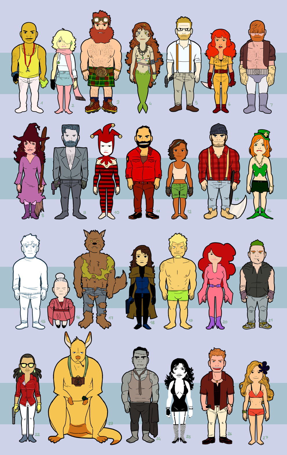
Yeah, so, the blog is 4-year-old (and the Collection is 3-year-old) today ! So I'm celebrating with this poster featuring some of the characters from all the illustrations !
Alors, le blog a 4 ans aujourd'hui, et je célèbre ça avec un petit poster rétrospectif des personnages de la Collection, cette série d'illustrations qui elle fête ces 3 ans.
Thumbs up to you if you can recognize from which drawing each character is (some should be easy, but others, like #5 or #18, should be harder !)
Pouce en l'air si vous arrivez à reconnaître chaque personnage et de quelle illustration il provient !
I might draw more Minis (you can already check the Facebook page and on Twitter where I posted two other ones)
Je referai peut-être d'autres Minis, ils sont plutôt marrants à dessiner ! (Vous pouvez dès à présent en voir deux inédits sur les pages Facebook et Twitter)
As for the fun, I made some statistics out of the data I gathered when drawing this and, among the 130+ characters there's :
- an unhealthy amount of general redheadness (1/4 of the characters, NOT surprising)
- beards (36% of the male characters)
- a lot of guns (something like 15, more surprising)
- more [partial] nudity than I would have thought (count yourself)
- 21 non-humans / supernatural characters (including two wolves and two female vampires)
- very little underage characters (10 out of 130 - I guess I really don't like children) and
- 15 animal sidekicks.
Enfin, si vous avez toujours des suggestions de sujet pour les prochaines illustrations de la collection, lancez les moi !
***
In other news, n'oubliez pas de checker le nouveau blog/webcomics collaboratif de Elosterv :
à surveiller de près ! ;)
And the Collection grows bigger with another artwork ! I just felt pretty good about the previous one and plenty of other things, so I drew this one rather quickly, and I'm pretty happy with it despite some flaws in the coloring. I think it's (one of) the best artwork(s) on this blog so far, do you agree ?
Comme quoi, il suffit d'un petit dessin pour que (presque) tout aille bien (plus une première visite au Manga Thé, une fin de semaine mouvementée, le 100ème like sur la page Facebook et un bond en avant significatif dans mes études). Du coup voici déjà une nouvelle illustration ! Après l'espace, la jungle... Il va me falloir des nouveaux thèmes pour les prochaines, alors si vous avez des idées je suis tout ouïe !
I'm going to need new themes for the next artworks, so if you have any ideas, throw them this way !
Oh, and, sorry, no gory Valentine's Day post this year, but you can always take another look at the previous ones ; Love Sneeze and Cupid !
Malheureusement, pas de traditionnel dessin gore de St-Valentin cette année, mais les deux précédents sont toujours là !
After a disastrous month of January (in, seriously, every aspect of my life : money, art - as you may have noticed given the lack of updates, money, work, school, money, health, personal life - and, did I mention money ?) and despite a very underwhelming beginning of February, here's finally the very first artwork of 2013 (which is also, the absolute very first thing I've drawn in 2013). Was it worth the wait ? You tell me !
Happy new year ! Bonne année !
Et voici ma première illustration de 2013, qui est d'ailleurs aussi le TOUT PREMIER dessin que j'ai fait de l'année (et oui, en février. Le mois de janvier a été vraiment rude). J'espère que l'attente en a valu la peine pour vous (pour moi oui !). Et en plus, cette année 2013 s'ouvre avec le 200ème post sur ce blog !! Merci à tous les visiteurs, que vous soyez des réguliers ou que vous passiez ici par hasard !
It's also a milestone : the 200th post on the blog !! Thanks to you all, whether you come here often or are just passing by !
Here the return of the Yxes series !! And, as you can see, it's quite seasonal ! (Don't worry about the characters, they're all Montrealers therefore they never get cold).
Like the two previous artworks, each character represents something, so try to take guesses (this time it's quite easier, promise)
- One character represents an actress playing the main character in a TV comedy that started this year
- one character is my version of a very popular legendary figure
- one is here because I love drawing wrinkled clothes
- one is here so I could draw a position I find hard to recreate
- and the last one because I just love this hair color (easy if you've seen my other artworks).
I didn't draw any animal because I already wasted the husky in the previous one ! (it would have been perfect for this one !)
Et voici le retour de Yxes ! Et en voilà un bien de saison ! Oui, les personnages sont tous à moitié à poil dans la neige, mais c'est des Montréalais, ils ne savent pas ce qu'est le froid.
Bref, comme les deux précédents, voici un petit jeu : essayer de reconnaître quel personnage représente quoi :
un représente une actrice qui joue le rôle principal dans une nouvelle série comique américaine
un représente un personnage folklorique occidental très connu
un se trouve là parce que j'adore dessiner des vêtements à plis
un se trouve là pour m'entraîner à dessiner une position que je trouve difficile
I've been planning on drawing a "Collection" artwork about music for a while, so here it is finally. I'm quite happy with the result as I'm still experimenting more and more. Hope you like it !
Is it me or I use a LOT of blue in my artworks (the three previous artworks were all blue-themed) ? I might have to think about it for the next ones...
Je voulais faire une illustration sur la musique depuis un bout de temps, donc la voici ! J'ai encore pas mal expérimenté sur la colo, j'espère que ça vous plaît. Pour la petite histoire, je ne vais pas hyper souvent à des concerts, mais je me souviens de celui de Charlie Winston il y a quelques années, où j'avais été impressionné par l'énergie du batteur, d'où Paisley Boom, le batteur calme/fou de l'illustration.
Below, the four main characters ; Coffee Bass, Chris Yeah, Bear Big D. Riff and Paisley Boom. They're the Paul Popes ! (I like giving people's names to bands I create : I mentioned the Jeff Smiths in Breslyn, New Arch, and the Mignolas in Trout & Salmon)
J'aime bien ces quatre persos, je vais sans doute les insérer quelque part dans une prochaine bédé (quand j'en commencerai enfin une...)